Concept · fictional brand · 2026 · Role: naming check, brand system, campaign design · Tools: type, shape and SVG texture (no photos, no generated images)
Low Static
A campaign for a fictional weekly club and magazine: one hour a week, no phone — one record, one long read, one walk.
The point of view: "The best thing on your feed is the hour you spend off it."
The only image is static, and it only ever clears.
01Problem / brief
Make a self-initiated campaign that shows editorial judgment, not a template: a brand with a clear idea, a small system, and the same idea carried across an ad, a social series, an email and a blog cover. Constraints I set: no photos, no faces, no feed screenshots, no hands holding phones, and no "detox" language.
02Process
Turn 1: check the name first. The working name was Static Hour. A web search showed it was already in use by a recently announced video game, so I dropped it. I also ruled out Off Signal, Still Hour, Quiet Static, Hush Static and Blank Hour because each one was already used by an event, a wellness brand, a creative studio, a product line or a campaign. Low Static only turned up two dormant podcasts and some song titles. That was a web search, not a trademark search.
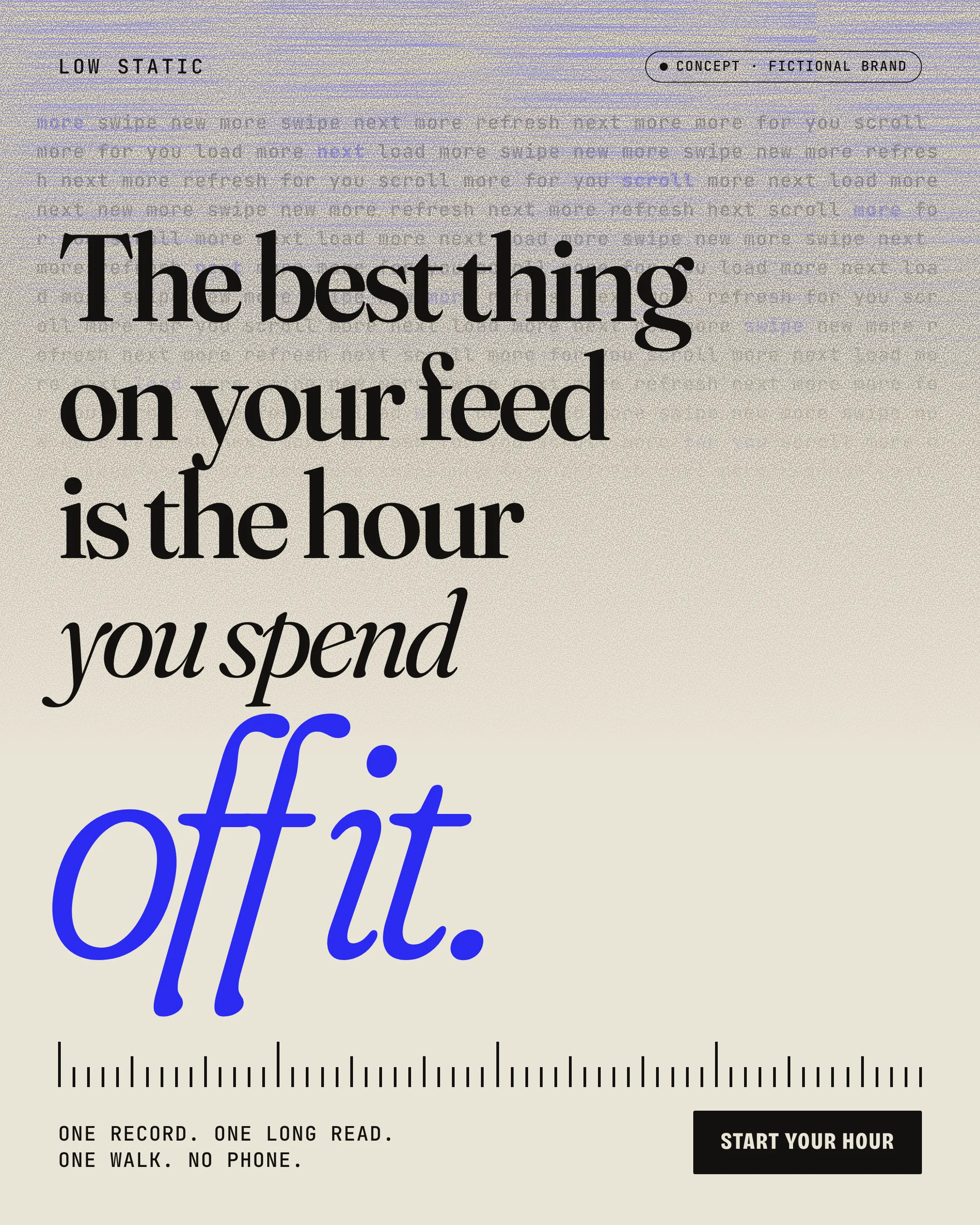
Turn 2: static as the only image. Grain and signal-tear streaks are drawn with SVG filters. They fill the top of each frame and fade to clean paper toward the bottom, so the layout itself acts out "the hour you spend off it." The rule is that static is texture and never sits behind small text.
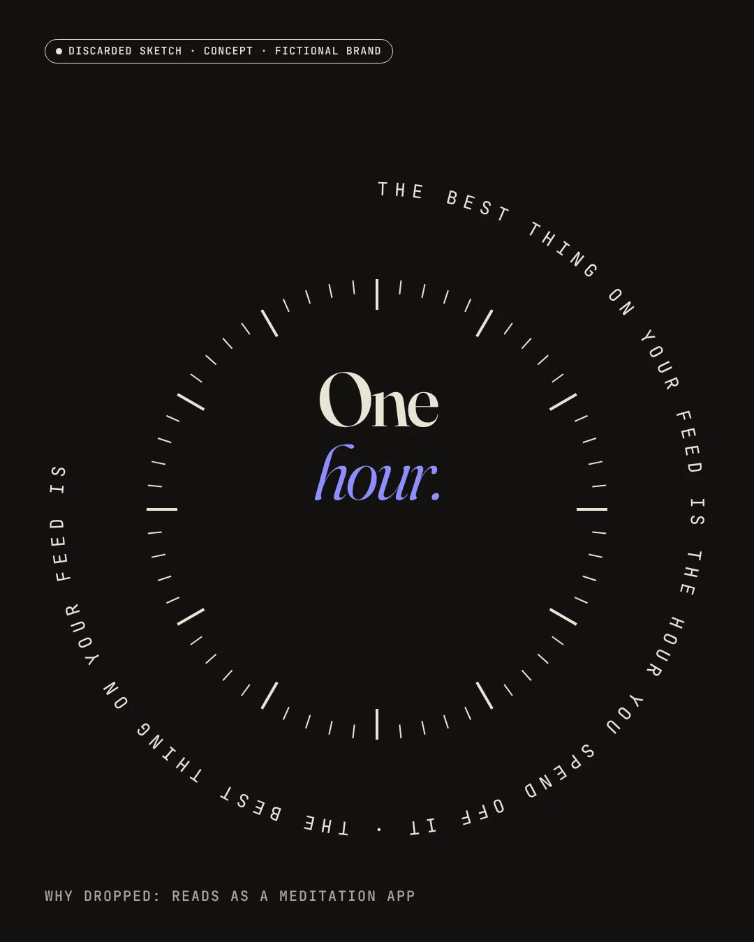
Turn 3: discarded — the dial. The first direction set the claim on a circle around a 60-tick clock face with "One hour." in the middle. It worked as a still, but I dropped it for two reasons. A clock with centered radial text is the standard look of meditation and wellness apps, which is the opposite of an editorial club with internet-culture roots. Text on a circle is also hard to read at feed size.
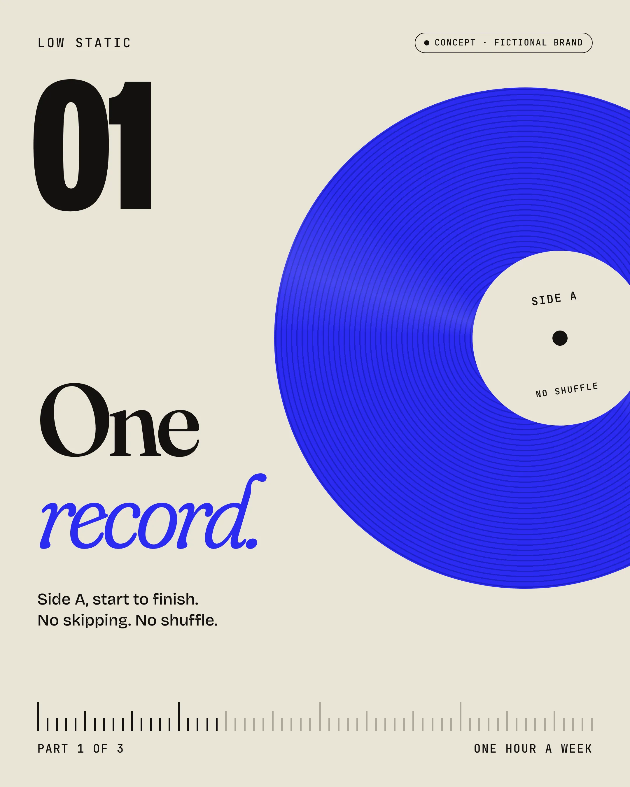
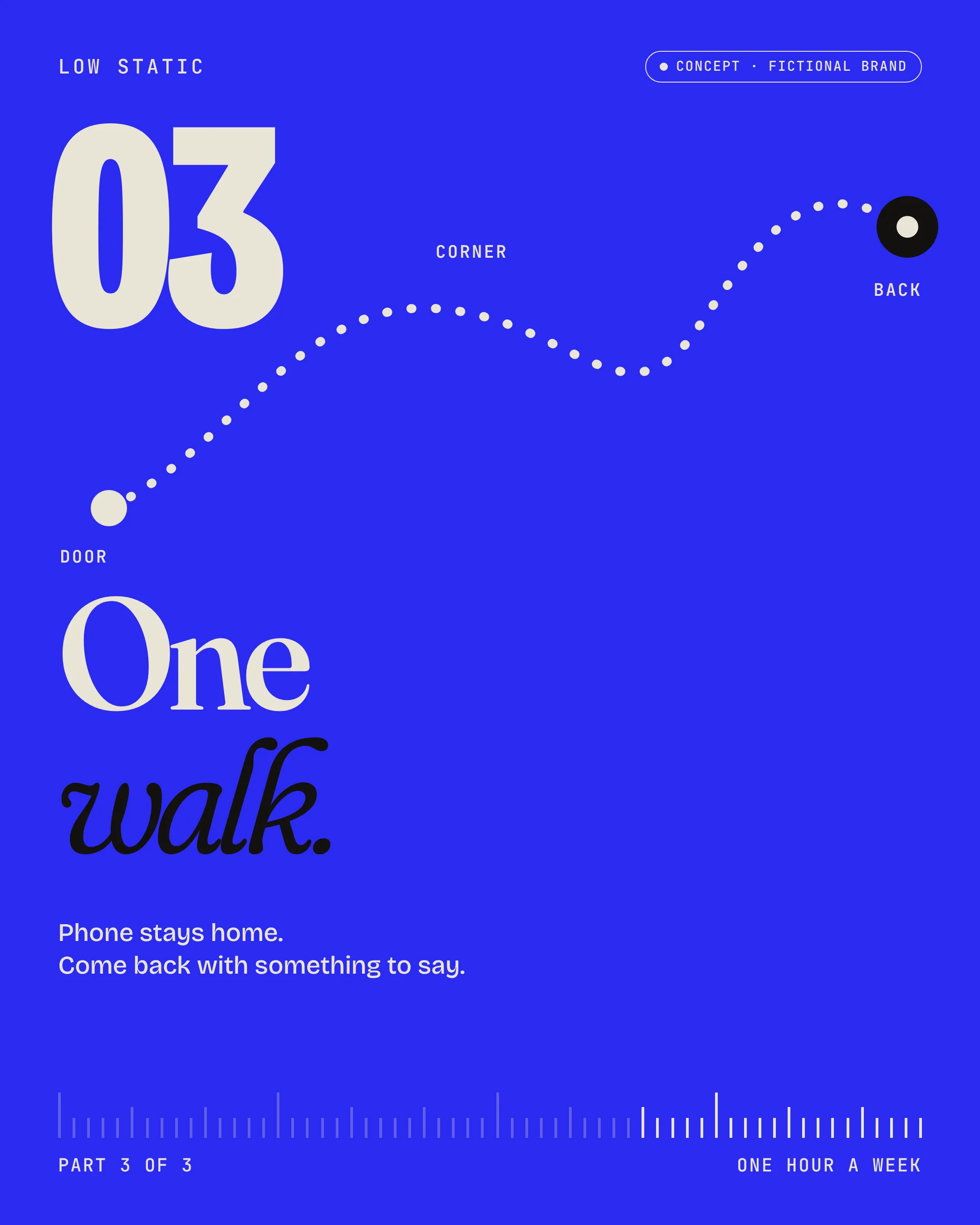
Turn 4: the hour as a ruler. I replaced the dial with a horizontal row of 60 ticks, one per minute, that closes every piece. The headline stays the hero. In the social series the ticks fill by thirds, so the three posts read as one hour.
03System
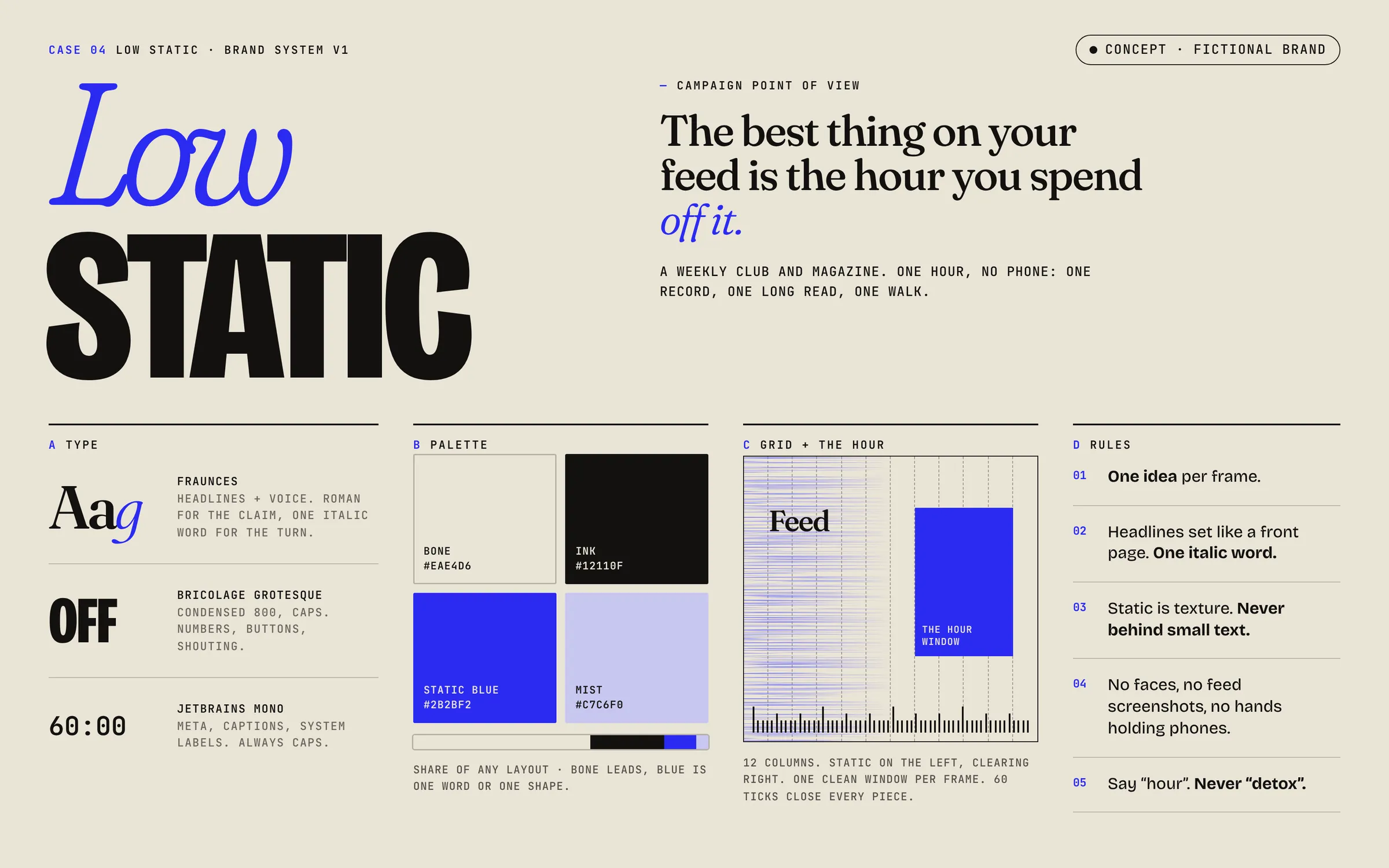
- Type: Fraunces roman for headlines and voice, set tight like a front page, with one italic word for the turn ("off it.", "read.", "still"). Bricolage Grotesque condensed 800 caps for numbers, buttons and shouting. JetBrains Mono caps for meta, captions and system labels.
- Palette: Bone #EAE4D6 · Ink #12110F · Static Blue #2B2BF2 · Mist #C7C6F0. Bone leads; blue is one word or one shape.
- Grid: 12 columns, static on the left clearing to the right, one clean window per frame, 60 ticks close every piece.
- Rules: one idea per frame; headlines set like a front page with one italic word; static is texture and never sits behind small text; no faces, feed screenshots or hands holding phones; say "hour", never "detox".
04Applications
- Static ad, 4:5: a wall of faded feed words ("more", "swipe", "refresh", "for you") sits behind the claim and clears toward the bottom, where "off it." is set large in Static Blue italic above the tick ruler.
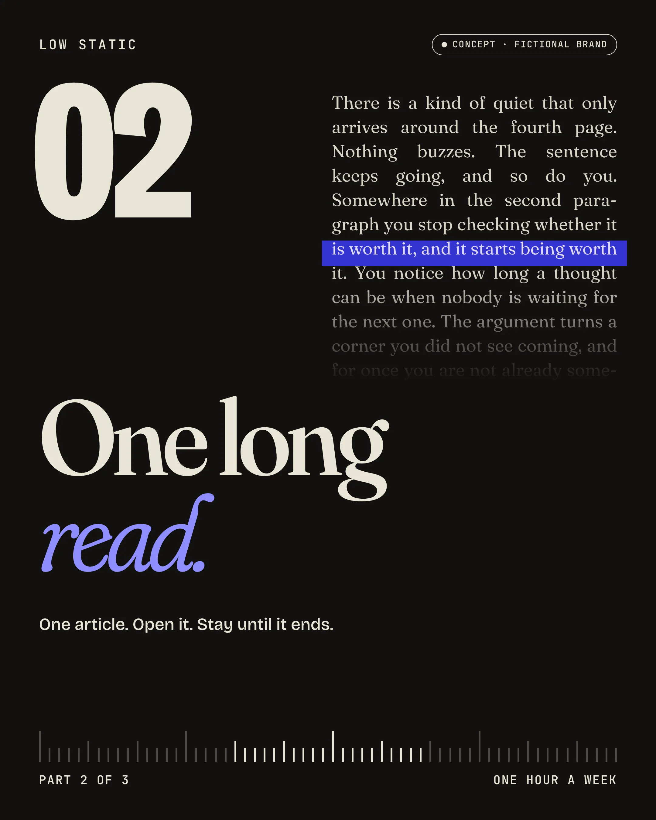
- Social series, 3 × 4:5: one post each for the record, the long read and the walk. The long-read post (02) is set on Ink, with an essay excerpt that fades out and one highlighted line. The excerpt is original filler text, not a quote.
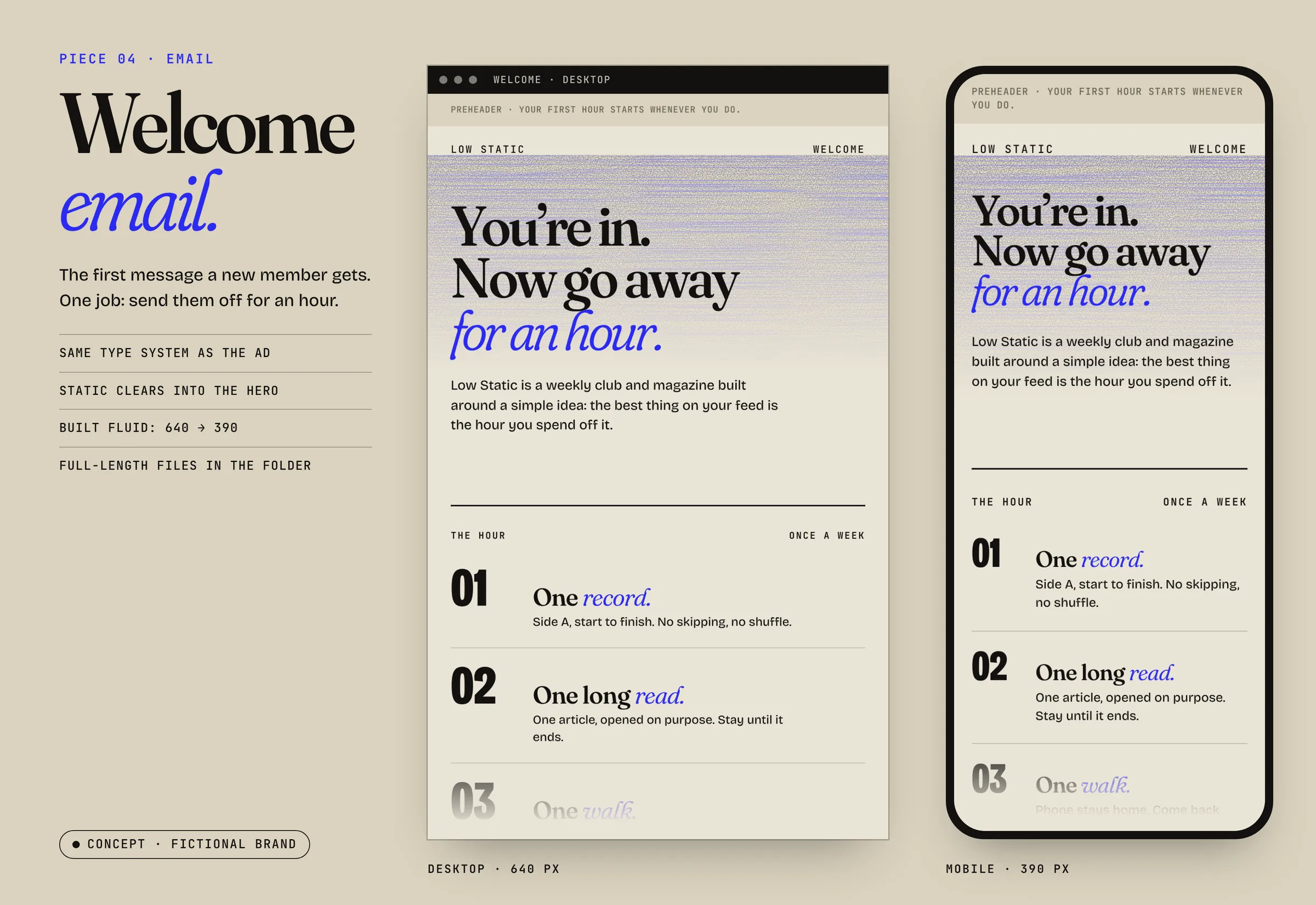
- Welcome email: desktop (640) and mobile (390) mockups, with full-length versions.
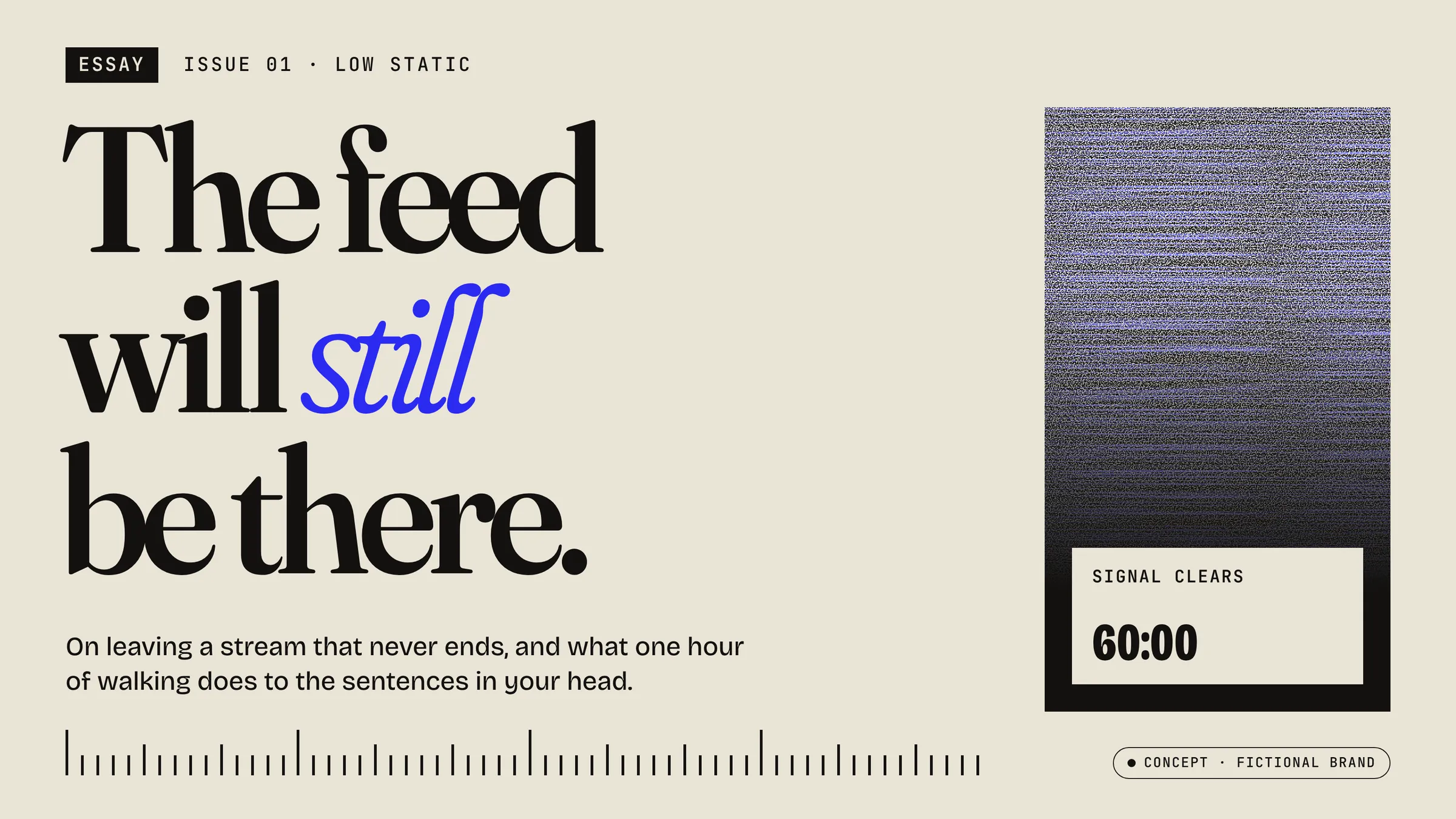
- Blog cover, 16:9: "The feed will still be there." with a dek, plus a static panel that resolves into a clean "Signal clears · 60:00" window.
05What I'd do next / constraints
- This is a fictional brand. It has no members, numbers or quotes, and nothing in it claims otherwise.
- The email is a fluid HTML/CSS design mockup. It is not a production table-based email, so that would be the next build.
- The name was checked by web search only. A real launch would need a trademark search.
- Next: a motion version of the static clearing over the hour, and a print issue cover to test the system off-screen.