Own product · 2026 · Role: brand identity, editorial design, art direction · Tools: HTML/CSS, templated build, AI-assisted layout drafts, scripted QA
The Gym Anxiety Field Manual
A 44-page printable guide for people who are new to the gym floor and stuck on the treadmill.
I treated it as an operations manual, not self-help: stations, routes, machine cards and blank logs.
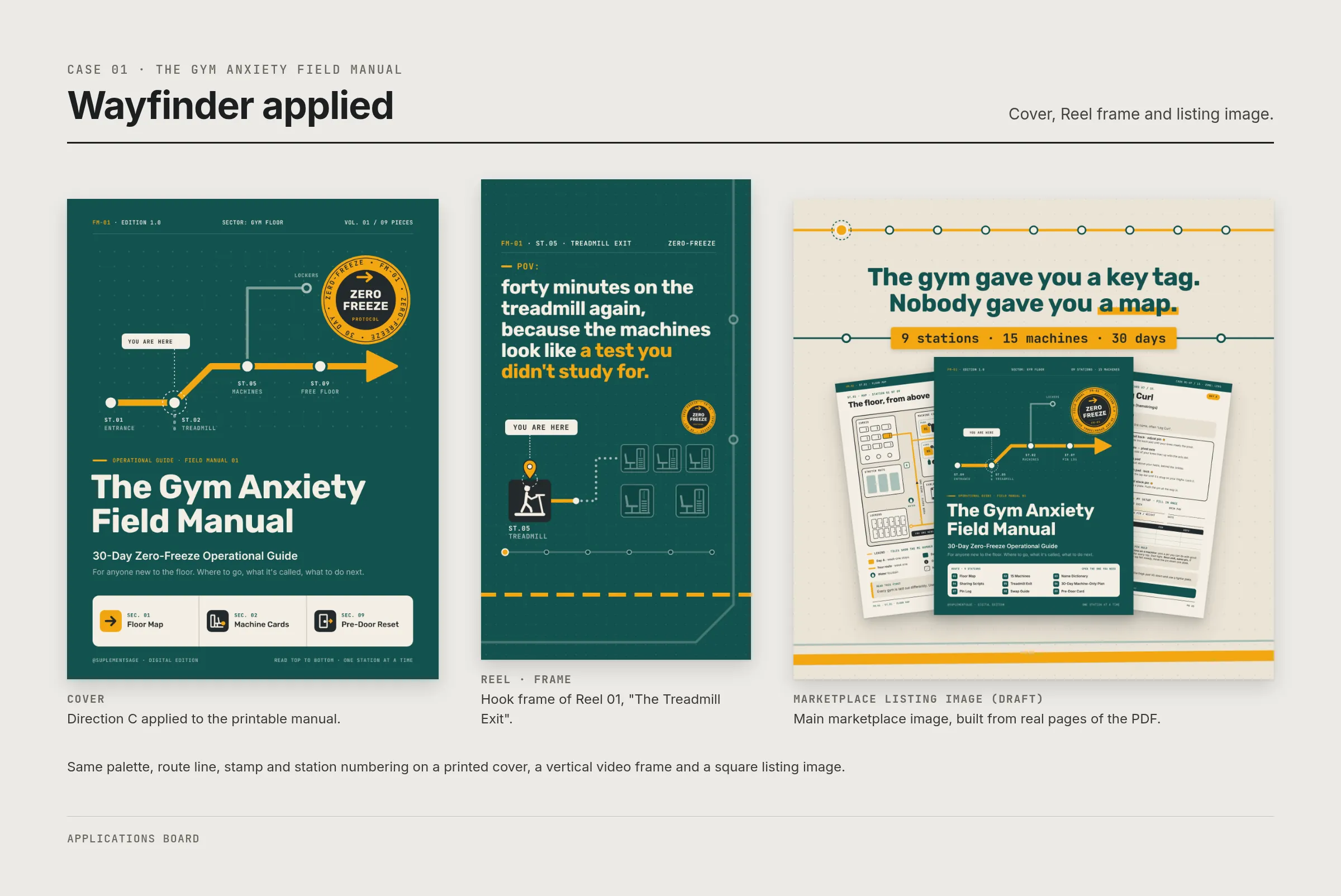
The identity, Wayfinder, borrows from calm transit signage so a scary room reads like a map.
01Problem / brief
New gym members often know what they want to do but freeze in the weights area: they don't know machine names, where to wait, or how to share equipment. Most of the category answers with motivation and bodies. The brief was the opposite: calm, precise and practical, with no shame and no "coach" aesthetic. It had to work for a 22-year-old on a cheap membership and a 32-year-old coming back after years at a desk.
02Process
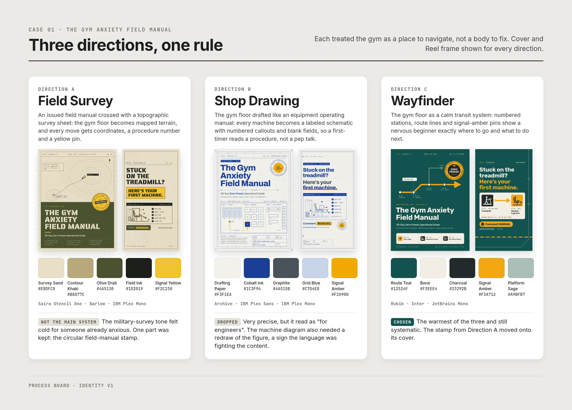
Turn 1: three directions, one rule. All three treated the gym as a place to navigate, not a body to fix. I ruled out sculpted bodies, gym neon, "girly" pink and aggressive black-and-red before any sketch.
- A · Field Survey: an official field manual crossed with a topographic survey sheet (sand, olive drab, signal yellow; Saira Stencil). Discarded as the main system: the military-survey tone felt cold for someone who is already anxious. One part was kept (see turn 3).
- B · Shop Drawing: an engineering blueprint with DWG/REV/SHEET title blocks (drafting paper, cobalt ink; Archivo). Discarded: very precise, but it read as "for engineers". It also needed a redraw of the figure in the machine diagram, a sign the language was fighting the content.
- C · Wayfinder: the gym as a calm transit system, with numbered stations, route lines and amber pins (route teal, bone, signal amber; Rubik / Inter / JetBrains Mono). Picked: the warmest of the three and still systematic.
Turn 2: map, not motivation. The opening line became "The gym gave you a key tag. Nobody gave you a map." Every section is a numbered station (ST.01 Floor Map … ST.09 Pre-Door Card), and every machine is a card (MC-01 … MC-15) with the same layout.
Turn 3: keep one thing from A. The circular "field manual" stamp from Direction A moved onto the Wayfinder cover. It gives the product an object-like quality that C alone didn't have.
Turn 4: built as a system. Pages are fixed 816×1056 sections rendered from one template, and a layout check fails the build if anything overflows. Name, seal and page order live in a single config file, so the edition can change without touching the layout.
03System
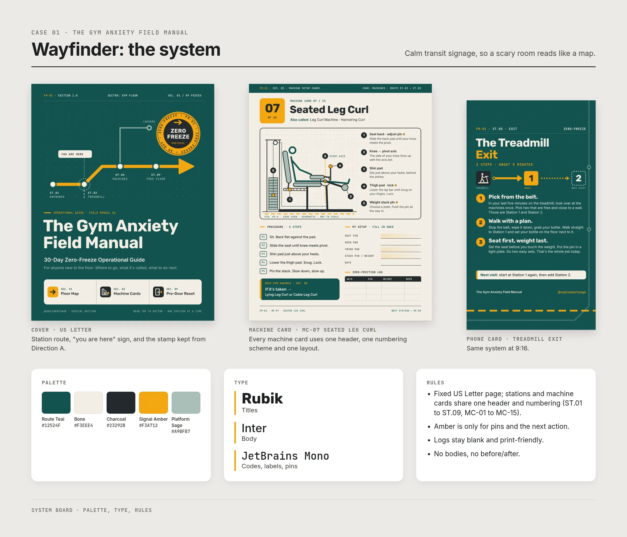
- Palette: Route Teal #12524F · Bone #F3EEE4 · Charcoal #23292B · Signal Amber #F3A712 · Platform Sage #A9BFB7
- Type: Rubik (titles) / Inter (body) / JetBrains Mono (codes, labels, pins)
- Grid: fixed US Letter page; stations and machine cards share one header and numbering scheme
- Rules: amber is only for pins and the next action; logs stay blank and print-friendly; no bodies, no before/after
04Applications
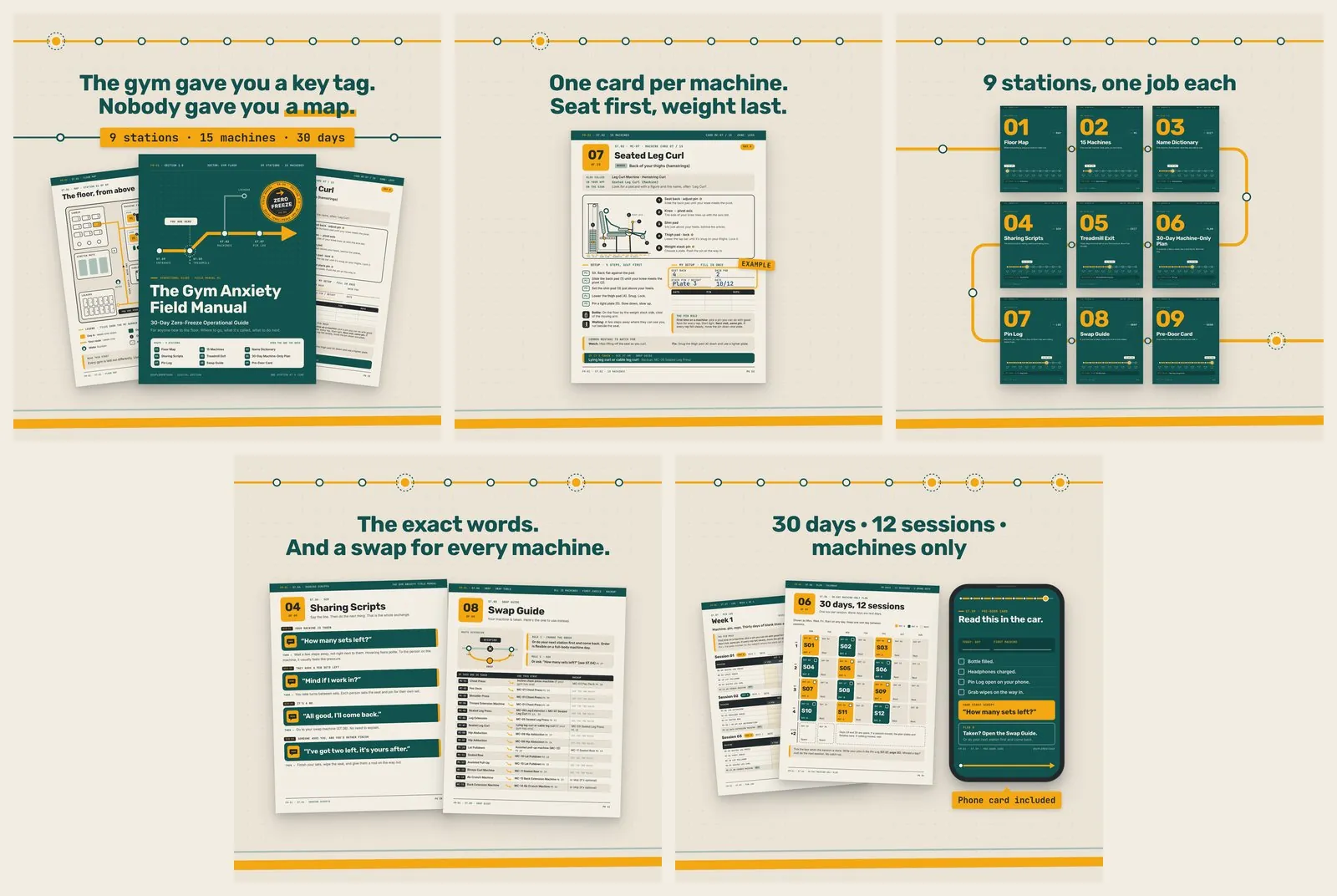
- Listing images: … 05-calendar-pinlog.png (or
05What I'd do next / constraints
- Constraint: everything had to print on a home printer and read on a phone, so color carries no information on its own.
- Constraint: no health or results claims; the guide only covers navigation and etiquette.
- Next: test the floor map against two or three real gym layouts. Right now it is a generic plan, and a real member would spot that.
- Next: a lighter "low ink" edition of the log pages.